Users get confused but never say so
Confusion rarely becomes a support ticket. People hesitate, guess, give up or work around it. How to spot confusion in your product and give people an easy way to tell you.
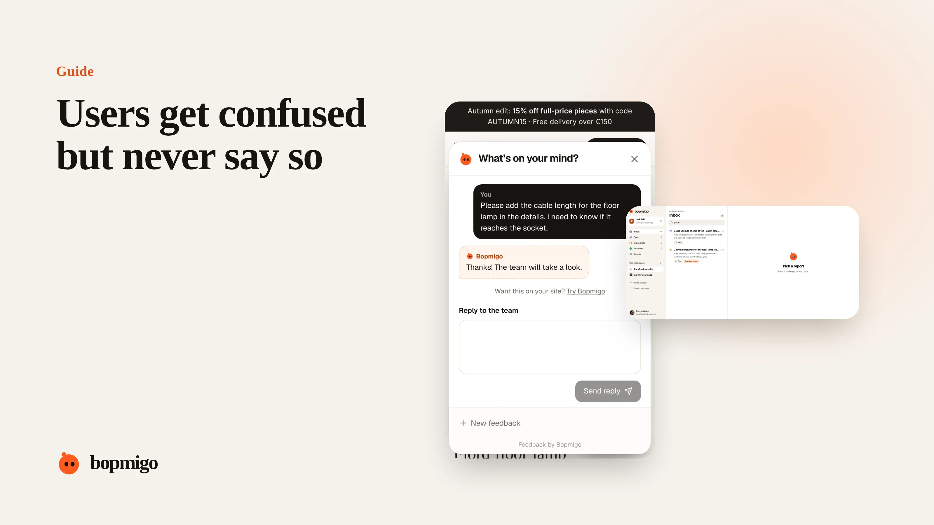
Short answer: confused people rarely report confusion, because it feels like their fault. They hesitate, click around, guess, or leave. Look for the signs in your data, ask at the specific moments people get stuck, and phrase the question so admitting confusion feels normal: “Anything unclear here?” rather than “Report a bug”.
Why confusion stays silent
- It feels like their fault. Nobody wants to report “I couldn’t work out your menu”.
- It isn’t a bug. Feedback options labelled “Report a bug” don’t invite it.
- They find a workaround. Slow, clumsy, but silent.
- They leave. Confusion in the first session usually ends in a closed tab.
Signs of confusion in your data
| Signal | What it often means |
|---|---|
| Many visits to help or search right after a page | The page didn’t explain itself |
| Back-and-forth between two pages | People can’t find where something lives |
| Forms started and abandoned | A field or step is unclear |
| A feature used once, never again | The result wasn’t what they expected |
| Support questions starting “How do I…” | The interface doesn’t answer them |
Ask in a way that invites confusion
- Label your feedback option for problems, requests and ideas, not only bugs.
- On complex pages, add a quiet line: “Anything unclear? Tell us.”
- In onboarding, ask “What were you hoping to do?” rather than “How was your experience?”
- Thank people for confusion reports as warmly as for bug reports.
Turn confusion into fixes
- 1
Collect a week of confusion
Every “how do I”, every “I couldn’t find”, every abandoned form you hear about.
- 2
Group by page
Confusion clusters. A few pages usually account for most of it.
- 3
Change words before layouts
A clearer label or one sentence of help often fixes it. Redesign only if that fails.
- 4
Ask the same people again
“We changed this page after your note. Is it clearer now?”
Common confusion hotspots
- Pricing pages: which plan, what happens after the trial, what “seat” means.
- Settings: where a setting lives, and whether it saved.
- Empty states: what to do first when there is nothing yet.
- Error messages that describe the system, not what to do next.
- Icons with no labels.
Watch five people use it
The quickest way to find confusion is to watch. Ask five people who match your users to do one real task while you stay quiet. Note every pause, every wrong click and every “hmm”. You will see the same two or three sticking points within the first three sessions. It costs an afternoon and finds problems no survey will.
Words that hide confusion
| They say | They often mean |
|---|---|
| “It’s a bit clunky” | There is a step they don’t understand |
| “I just use the old way” | The new way wasn’t clear enough to trust |
| “Is there a way to…” | The feature exists but they can’t find it |
| “I asked my colleague” | The interface didn’t answer them |
| “It’s fine” | They have stopped expecting better |
Fixes that work without a redesign
- Rename buttons to say what happens: “Save and send” rather than “Submit”.
- Add one line of help under fields people get wrong.
- Show an example in empty states: what a filled-in version looks like.
- Confirm actions clearly: “Saved” in the same place they clicked.
- Put the most common task first, not the most technical one.
Measure whether it got better
After a change, watch the same signal that pointed you there: fewer “how do I” questions about that page, fewer abandoned forms, fewer back-and-forth visits. Ask the people who reported confusion whether it’s clearer now. Their answer is the best test you have.
A worked example
A booking tool notices that many new customers open the help page right after the availability settings screen. Nobody has reported a bug. Adding “Anything unclear here?” to that screen brings in sentences like “I don’t know if this is my opening hours or my booking hours.” Renaming the section and adding one line of explanation stops the help visits, without a redesign.
Questions to ask about your own product
- Which page do people visit help or search from most?
- Which form is started more often than it is finished?
- Which setting do support agents explain most often?
- Does your feedback option invite questions, or only bug reports?
Is confusion a bug?
For the person confused, it feels like one. Treat it with the same care: it costs you the same users.
How do I know if a change made things clearer?
Watch the signal that pointed you there, and ask the people who reported it.
A five-person test script
- 1
Set the scene
“We’re testing the product, not you. Please think out loud.”
- 2
Give a real task
“You run a small salon. Set up your opening hours and take your first booking.”
- 3
Stay quiet
Don’t help. Note every pause, wrong click and question.
- 4
Ask afterwards
“What was hardest? What did you expect to find that wasn’t there?”
- 5
Fix the top three
After five sessions, fix the three moments that tripped up most people.
Run it again after the changes. The same task should feel noticeably smoother.
How Bopmigo helps
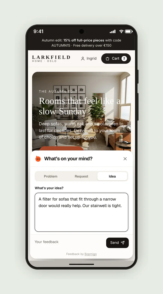
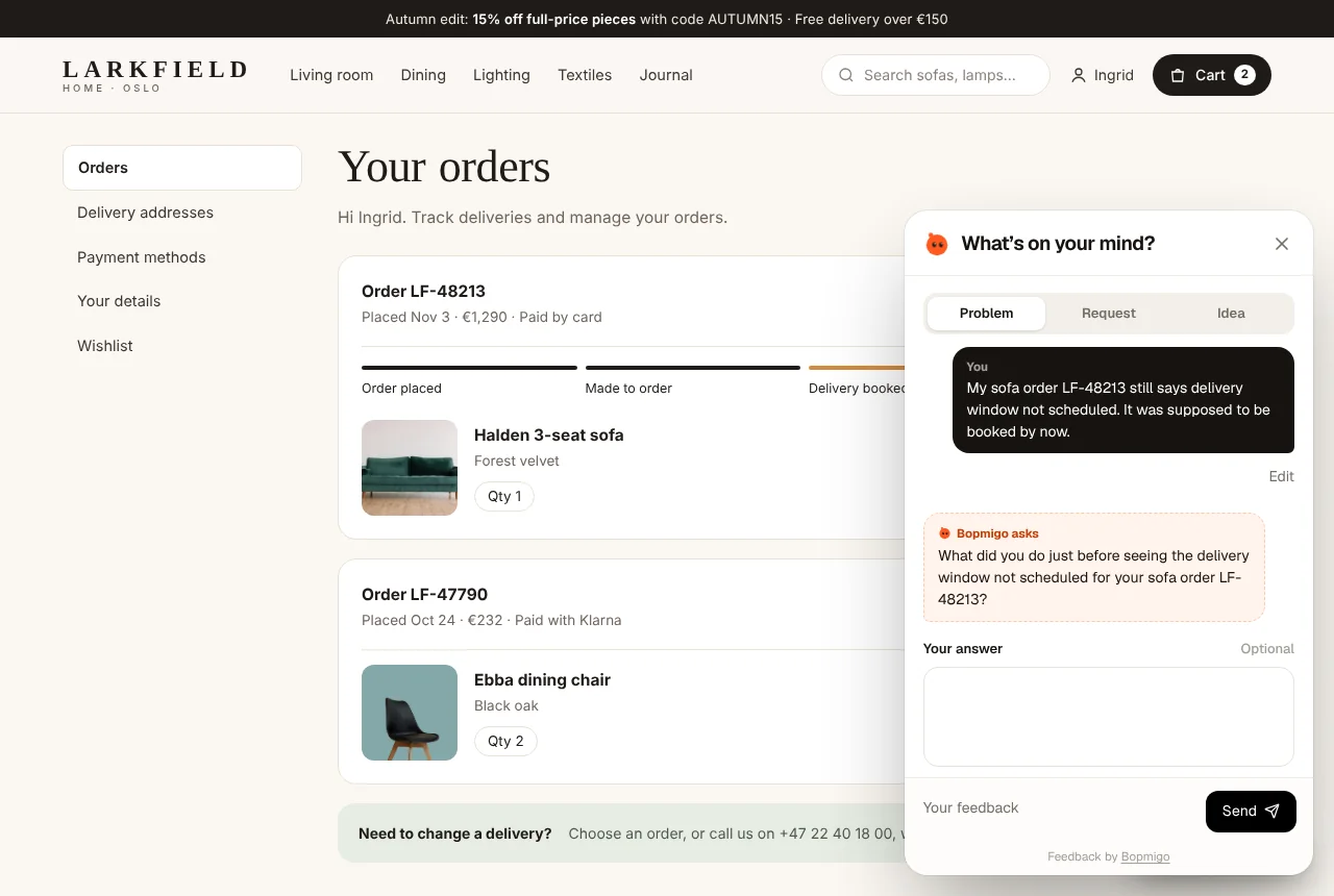
People can choose Problem, Request or Idea and write a sentence in their own words, so “I can’t find how to…” has an easy home. Each report shows the page it came from, and related reports are grouped, so you see which pages confuse the most people.